
Wikipedia:Featured picture candidates/John Field (composer)
John Field[edit]
Voting period is over. Please don't add any new votes. Voting period ends on 6 Dec 2022 at 18:58:29 (UTC)

- Reason
- Irish composer John Field is credited as the originator of the piano nocturne. His work was highly regarded by contemporaries and influenced major composers including Frédéric Chopin, Johannes Brahms and Robert Schumann.
- Articles in which this image appears
- John Field (composer), Classical music of the United Kingdom, Music of Ireland, +1
- FP category for this image
- Wikipedia:Featured pictures/People/Artists and writers
- Creator
- Anton Wachsmann (de), restored by Bammesk
- Support as nominator – Bammesk (talk) 18:58, 26 November 2022 (UTC)
- Comment More work to do on the background. Charlesjsharp (talk) 19:54, 26 November 2022 (UTC)
- Not a huge fan of the crop, especially as the supposed original isn't; it's both cropped and I think has different colours? Hard to tell. But, either way, it's misleading to present as an original something that isn't. Adam Cuerden (talk)Has about 8.2% of all FPs. Currently celebrating his 600th FP! 06:37, 27 November 2022 (UTC)
- @Adam Cuerden: what do you mean by "misleading to present as an original"? Are you critiquing the wording used in the "other versions" list in the file description template? Bammesk (talk) 03:01, 30 November 2022 (UTC)
- File:John field.jpg nowhere presents itself as anything but a copy of Gallica's original. Adam Cuerden (talk)Has about 8.2% of all FPs. Currently celebrating his 600th FP! 05:29, 30 November 2022 (UTC)
- Thanks Adam, I understand. I am going to upload the original from Gallica and then update the file descriptions. I will restore the original and aim for a new nomination. What, if any, cropping of the borders is acceptable? Bammesk (talk) 03:00, 1 December 2022 (UTC)
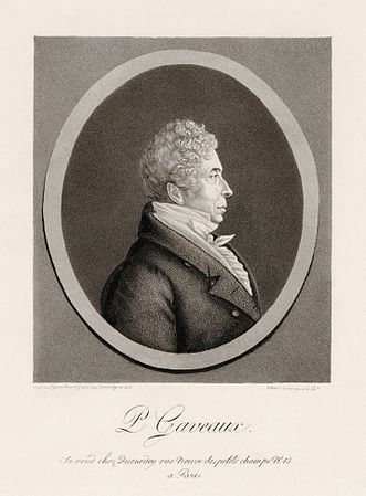
- Perhaps this isn't the place, but I'll do it here. First of all, the original here is 17th century, which can be very spaced out. But I'll start by walking you through my choices in the Pierre Gaveaux restoration, then we can discuss contrary issues:
- Thanks Adam, I understand. I am going to upload the original from Gallica and then update the file descriptions. I will restore the original and aim for a new nomination. What, if any, cropping of the borders is acceptable? Bammesk (talk) 03:00, 1 December 2022 (UTC)
- @Adam Cuerden: what do you mean by "misleading to present as an original"? Are you critiquing the wording used in the "other versions" list in the file description template? Bammesk (talk) 03:01, 30 November 2022 (UTC)
-
 Original
 -
 Restoration
_-_Original.jpg)
.jpg)
- So, for prints from the 17th century/late 18th, you can often tell exactly where the edges of the printing plate were due to the pressures used in printing. Just inside that edge is usually a good starting point for considering the crop, as generally speaking, the compostions seem to be balanced more within the plate than considering the page outside of it, meaning that the space outside the place is just deadspace.
- However, there's also a trend for extremely spaced out captions. Pierre Gaveaux is a little spaced out, but with the wider margins looks fine.
- Now, the John Field image - the original is mislinked, it's here - has a bit more space between image and caption. It can get worse from here, take [1], which has a tiny little credit right at the bottom. It's also not very good, which is convenient. Then there's [2] - where I'm pretty sure the text at the top is just really beautiful handwriting. But it feels a little uncentred with the caption.
- {{CSS image crop}} exists, and can be helpful here: Include everything using nice wide margins, crop it in articles.
- So, I suppose my point is, there might not be a single right answer; it might be the best choice is to provide a range of variants. The most important thing is to make it clear how it's cropped and what, if anything, was cropped out. Also, I think one should have a fairly maximale restoration uploaded, even if you crop secondarily from there, because you have to consider reuse. If I need to crop the Pierre Gaveaux to fit a specific page aspect, say, for a programme for a performance of his works, I have enough free space to be able to make it work in a lot of use cases. With a very tight crop, you only really have the crop provided. In recent images, one of the reasons the Geraldine Ulmar image - the lead on her page - works with the fairly tight crop is A. I used additional restoration to help fix up the edges for the new crop because seeing the whole edge when you see the mount is very different than little traces of the edges from imperfect straightness, or cropping tighter than needed. and B. we can always zoom back out because that's linked. Adam Cuerden (talk)Has about 8.2% of all FPs. Currently celebrating his 600th FP! 19:48, 1 December 2022 (UTC)
- Ok thank you, that's very helpful. I will upload a restoration of the entire Gallica original, then have a separate crop file or files. Yes I got the Gallica link crossed ! with this image in John Field's category; I have fixed it now. On a sidenote, he lived in late 18th, early 19th century, so I don't quite understand your reference to: "the original here is 17th century". Bammesk (talk) 00:48, 2 December 2022 (UTC)
- Sorry, haven't been sleeping well. I meant 1700s, early 1800s, but said century. Adam Cuerden (talk)Has about 8.2% of all FPs. Currently celebrating his 600th FP! 04:51, 2 December 2022 (UTC)
- Ok thank you, that's very helpful. I will upload a restoration of the entire Gallica original, then have a separate crop file or files. Yes I got the Gallica link crossed ! with this image in John Field's category; I have fixed it now. On a sidenote, he lived in late 18th, early 19th century, so I don't quite understand your reference to: "the original here is 17th century". Bammesk (talk) 00:48, 2 December 2022 (UTC)
- Oppose Hadn't noticed the crop. Charlesjsharp (talk) 10:58, 27 November 2022 (UTC)
- I withdraw this nom. I will fix the issues and nominate later. Bammesk (talk) 17:34, 3 December 2022 (UTC)
Not Promoted --Armbrust The Homunculus 21:55, 4 December 2022 (UTC)
- Withdrawn nomination. Armbrust The Homunculus 21:55, 4 December 2022 (UTC)