This template is within the scope of WikiProject Trains, an attempt to build a comprehensive and detailed guide to rail transport on Wikipedia. If you would like to participate, you can visit the project page, where you can join the project and/or contribute to the discussion. See also: WikiProject Trains to do list and the Trains Portal.TrainsWikipedia:WikiProject TrainsTemplate:WikiProject Trainsrail transport articles
I strongly feel it's more important for the station name sizes to be consistent in a diagram like this, so that at a glance people can easily pick out the most relevant info (i.e. the stations), than it is for the diagram to be super-compact... but I don't want to get into edit warring over it. Is there a reason other than personal preference for being inconsistent on this front, splitting long station names, and making them tiny? Because I would argue the desire for compactness is at direct odds with legibility, and surely it's more important people can read the diagram easily than it is for the diagram to be inconsequentially narrower.
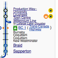
Specifically, the lower right side of the diagram (the Lougheed branch) is getting ridiculous. As can be seen here, Production Way and Lougheed are nearly indistinguishable from the spur to the Evergreen Extension, the BC 1 crossing, and the nearby municipal boundaries. —Joeyconnick (talk) 19:23, 7 December 2016 (UTC)[reply]
My opinion is that all station names should be easily distinguishable from other text (the more it stands out, the better). The best way would be to have station names in full size and/or bold station names (see Template:Kwun Tong Line RDT for an example). Briguychau (talk) 06:27, 8 December 2016 (UTC)[reply]
I agree that station names should be in full size, although alternatively bold station names would also be fine. I've noticed that with a lot of UK diagrams in particular, {{BSsplit}} is somewhat overused for station names purely for the sake of making the diagram slightly thinner. Jc86035 (talk) Use {{re|Jc86035}} to reply to me 06:59, 8 December 2016 (UTC)[reply]
The use of bold should be avoided in RDTs because WP automatically emboldens a self-link when transcluded back on to the referenced page. (Does that make sense to you?) Reducing the width of an RDT is not a bad thing, because the diagrams are an adjunct to the main article: if they are too wide they obstruct and detract from the text. (And too much empty white space just looks ugly.) Useddenim (talk) 16:18, 8 December 2016 (UTC)[reply]
I get what you're saying about bold but a) the maps in question are unlikely to be transcluded onto a referenced page (I've never seen a routemap added to each and every station on a line, at least in the TransLink context) and b) even if they were, that station's name would be bolded but wouldn't be hyperlinked, so it would still standout/be different from the other bolded station names (which would all still be hyperlinked). That doesn't interfere with anything... it just means self-references on pages would not look as different from station names as they would otherwise.
Personally I find the bolded station names overkill, but they don't interfere with transclusion.
As for too-wide maps impinging on the article text, well, we didn't choose the length of the station names... there are ways within articles where that happens to lay out the content of the article to minimize that if it's a problem for a specific article, but the routemap design shouldn't be dependent on what pages it may or may not get included on.
And finally, with respect to too much white space being ugly, that's a matter of taste. Web design in general these days seems to be favouring more white space (which makes for what I think is seen as "cleaner" designs) and while I can't say I'm a huge fan of that trend, I come back again to the issue of quick and easy legibility, and consistency, of the diagram. Example 1 above is more consistent and easier to read. —Joeyconnick (talk) 19:33, 8 December 2016 (UTC)[reply]
I don't disagree with the notion of saving a few pixels of width (e.g. I wouldn't quibble about the width between the two "self-referenced" examples), but you have to admit there is a significant difference between "Example 1" and "Example 2". Useddenim (talk) 01:49, 9 December 2016 (UTC)[reply]
It is noticeably wider, yes. I'm not saying it isn't. But it's not crazily wider (like 50% wider or anything). It is noticeably easier to read, though, and it treats all station names the same, and I think that's more important than saving pixels. It's not the splitting of the name onto two lines that is the problem, in my opinion; TransLink's own route maps on the trains themselves do that. It's the font size being decreased that is the issue. If there were a way to split the names onto two lines without decreasing the font size, I'd be open to that. —Joeyconnick (talk) 03:48, 9 December 2016 (UTC)[reply]
@Useddenim and Joeyconnick: Given that the diagram isn't used in the station articles so bolding isn't a problem, would this work? (I'd also change the Millenium Line diagram to be consistent as well.) Jc86035 (talk) Use {{re|Jc86035}} to reply to me 02:26, 9 December 2016 (UTC)[reply]
Bolding doesn't address my concerns about legibility or consistency, so at least on my part, that won't work. —Joeyconnick (talk) 03:48, 9 December 2016 (UTC)[reply]
@Joeyconnick: Isn't it consistent in that all the station names are emphasised by the bolding? Jc86035 (talk) Use {{re|Jc86035}} to reply to me 07:32, 9 December 2016 (UTC)[reply]
@Jc86035: They'd be consistent in that they were all bolded, yes, but not in that some would be in one font size and some in another. —Joeyconnick (talk) 18:19, 9 December 2016 (UTC)[reply]
Alternatively, we could also move all the labels on the left side to the right side, which would solve the width problem. Jc86035 (talk) Use {{re|Jc86035}} to reply to me 10:49, 9 December 2016 (UTC)[reply]
I wasn't aware that could be done... can you give an example? —Joeyconnick (talk) 18:19, 9 December 2016 (UTC)[reply]
Might look something like this, but the Skybridge text might be an issue (although putting both blocks of text on the same side wouldn't make the diagram any wider). Jc86035 (talk) Use {{re|Jc86035}} to reply to me 09:58, 10 December 2016 (UTC)[reply]
Why am I in this conversation? I don't care about the whole station name issue. The only thing I care about is adding the mention of a future extension after KG station. I tried to do it but couldn't align the pictogram properly. Cganuelas (talk) 03:27, 9 December 2016 (UTC)[reply]
That would be because of me. I pinged all of the recent editors to the template so anyone who was interested could participate in the discussion. If you aren't interested, please feel free to ignore. —Joeyconnick (talk) 03:39, 9 December 2016 (UTC)[reply]
Will ignore but will start a new section for my concern. Cganuelas (talk) 10:23, 9 December 2016 (UTC)[reply]
Recently from TransLink, there has been talk of a possible extension of the Expo Line and I tried to add it to the template, only for it to be reverted due to troubles with formatting. Please advise. Cganuelas (talk) 10:23, 9 December 2016 (UTC)[reply]

