
User:Marian
| Wikipedia:Babel | ||||
|---|---|---|---|---|
| ||||
| Search user languages |
List of Wikipedia contributions[edit]
- UI design proposal for Wikipedia (March 2002, read below)
- Added german article Wochenschau
- Added german article Michel Gondry
- Minor changes on various german pages
A UI design proposal for Wikipedia[edit]
DISCLAIMER: The UI design proposal has been made in March 2002 as part of my preparations for my intermediate exams. I leave it here for the sake of future reference. German language are invitet to take a look at my short thesis about [Design für Open Source Projekte].
As you can read below I feel that it is possible to make Wikipedia an even better experience for it's users. A great part could be done through a new UI design.
To be as constructive as I possibly can, I made an initial design proposal to throw it in the circle and gather some thoughts from you all who care.
http://kisd.de/~marian/wikipedia/redesign_article_1_thumb.png
[Click here] for full size image (PNG format).
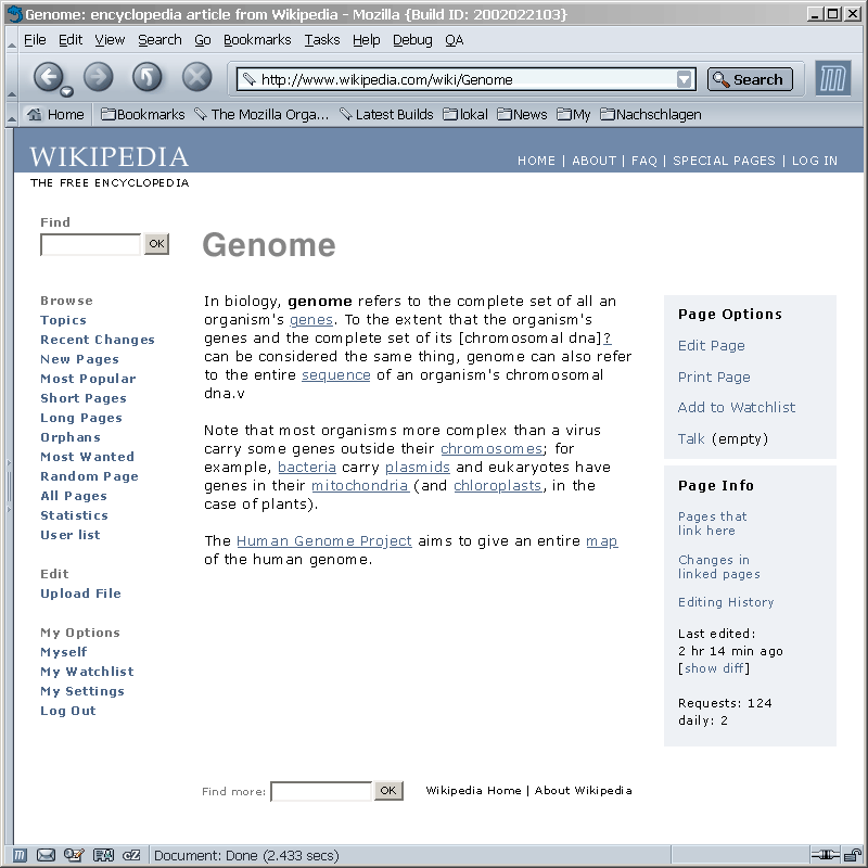
What you can see on the screen is a mockup of a short article page (Genome) that shows the overall look and feel of the site.
Here are some thoughts:
- The appearance could be considered very calm, quiet, friendly, subtle, bright.
- The visual design opts for ease of use, speed, compatibility. (Call it a Googleish design, if you want.)
- Ease of use means: Newbies and experts find their way and get the work done quickly.
- Speed means: The HTML would be lightweight as it is right now.
- Compatibility means: The template would of course technically support all browsers, but also optically support the huge range of content styles in the articles. Thats the reason why color is very reduced and the use of type is subtle.
- The appearance is not designed towards originality or web design awards.
- The logo... I consider the current logo good, but too detailed for use on all pages. That's why I would propose to use a simplified version on all pages. A "text ball" version could be used on the main page, though. (and for merchandise... ;-)
- My preferred type order for text would be "Verdana, sans-serif". Verdana is the most legible type for the screen. As Wikipedia is 99,9% text, we should care about this.
- The article headline is not Verdana, because Verdana doesn't look nice in larger sizes. It's Helvetice here, so in terms of CSS just call it "sans-serif".
- Probably the most important thoughts are in the organization of the page items. As you can see. In detail:
- The search input (titled "Find", because "Find" is more optimistic than "Search" ;-)), probably the most important interface to Wikipedia, has a central position.
- Distinguished from the Find input are the "Browse" links to the content. I sorted by what I guess could be most important to the majority of users.
- General Editing (File Upload) and Personalized links to personalized specials are below.
- important site-wide links are in the blue bar at the top right
- the article, of course, goes to the middle
- and functions and information related to the article is positioned right hand side from the article.
- The page scales t a 100% browser width,just as the current template does.
- The template would need either one or two images, not more.