This file is within the scope of WikiProject Medicine. Please visit the project page for details or ask questions at Wikipedia talk:WikiProject Medicine.MedicineWikipedia:WikiProject MedicineTemplate:WikiProject Medicinemedicine articles
This file is within the scope of WikiProject Disaster management, a collaborative effort to improve the coverage of Disaster management on Wikipedia. If you would like to participate, please visit the project page, where you can join the discussion and see a list of open tasks.Disaster managementWikipedia:WikiProject Disaster managementTemplate:WikiProject Disaster managementDisaster management articles
This file does not require a rating on Wikipedia's content assessment scale.
It's quite interesting to note that this graph looks very compatible with an exponential for the USA and Global totals. Mexico had huge lags in reporting, so it's harder to say, but it still looks like it would be compatible (or: a straight line from the beginning to the end is quite compatible with most of the data, except for the days where there was little or no update). "Other" total looks linear. Deaths still is a very small sample to get any conclusions.
This configuration is compatible with an epidemic in the USA and Mexico (maybe in Canada too?), with residual cases in other countries. It also makes the Mexican position that "everything is under control" hard to justify. Pmbarros (talk) 18:26, 12 May 2009 (UTC)[reply]
I think this graph is fantastic and strongly support its inclusion in articles on the epidemic. It conveys information on the growth in the number of cases much more effectively than a non-logarithmic graph. I've even used it in my mathematics course to demonstrate a real world example of exponential growth to my students. However I have One Criticism. Please do away with the separate axes for deaths and cases. Use the same scale for both. If plotted on the same scale the line for cases should end up parallel to the line for deaths, with the vertical distance between them representing the fatality rate for the virus. You can't look at this if separate scales are used. The fact that the two lines do not look parallel if the same scale is used is interesting and by itself is an indication that we probably don't yet have accurate figures on the infection rate in mexico. By using separate scales which are differently logarithmic (logarithms to different bases) you are obscuring this. Hawthorn (talk) 05:28, 13 May 2009 (UTC)[reply]
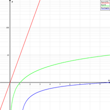
Has anyone else noticed that the file name states "Logarithmic" but the graph shows exponential scale? If you aren't aware of the difference:
Log Logarithmic scale
Exponential Exponential growth
--Pleitch (talk) 23:34, 13 May 2009 (UTC)[reply]
"A logarthmic scale is a scale of measurement that uses the logarithm of a physical quantity instead of the quantity itself.", and this is what is represented here: it's a Log-Linear plot. You can see that it is the same as the image on the right Log-lin scale, but it has powers of 2 instead of powers of 10. An exponential growth (red curve on the right) appears linearized, like the totals on this graph. Pmbarros (talk) 13:43, 14 May 2009 (UTC)[reply]
Okay - I see. I was thinking that it was stating that it was applying a logarithmic transformation to the data, which it clearly wasn't.--Pleitch (talk) 00:18, 19 May 2009 (UTC)[reply]
Man alive, who the hell made this graph! It is quite clearly increasing at an exponential rate, but because some fool has logged it and not explicitly shown it, it looks like it is levelling off. Please please please put it back, it looks stupid. —Preceding unsigned comment added by 78.86.233.87 (talk) 19:09, 2 June 2009 (UTC)[reply]
Glad I'm not the only one who noticed. I was thinking more along the lines of looking something like this, but with up to date data of course. Any objections? I don't want to waste my time if people are going to complain and revert back to this one (which really does give a false impression that the spread is slowing). LokiiT (talk) 07:03, 3 June 2009 (UTC)[reply]
Why would you replace the logarithmic graph with a linear one? This one shows the data in a different way: a straight line represents an exponential growth, while the linear graph () shows exactly the same as you suggested. This log graph is interesting because it shows that right now the number of reported cases in the USA and Mexico is slowing down, possibly due to not everyone being tested, while the figures for the rest of the world are a VERY clear exponential (or a very clear straight line in this graph). The linear graph can only show that rates are increasing, but it can't show if it's an exact exponential as easily as this one does. 143.106.18.169 (talk) 16:30, 7 June 2009 (UTC)[reply]
This graph is embarrassing. Why have a log scale? It completely deceives the reader into thinking the number of cases are "leveling off" when this is clearly not the case. The graph should be replaced with a linear interpretation of the number of swine flu cases. This will remove any confusion over the current log scale and give a much more useful interpretation of the data!
I suggest including both a linear graph (for the ordinary reader) and semi-logarithmic graph (for those more interested in the rate of growth). —Preceding unsigned comment added by 203.219.43.22 (talk) 01:26, 11 June 2009 (UTC)[reply]
That's the point: both types of graphic exist on Wikipedia, by the same author, updated simultaneously. What more do you want? 143.106.18.169 (talk) 18:48, 11 June 2009 (UTC)[reply]
I'm interested to know the choice of the countries shown on this graph. Now the disease has spread to everywhere, so would it be wise to remove the countries, or add new countries to this graph? - Xavier Fung (talk) 06:29, 3 June 2009 (UTC)[reply]
Well, Mexico was of special interest as the first country, as long as USA has more cases then all other countries together they could have a own line. Canada was for some weeks the only other country with high numbers but so is not the case anymore. I suggest Canada and others are merged into one line. If any other country need a graph they could do a special file. /Johan Jönsson (talk) 17:40, 10 June 2009 (UTC)[reply]
by the way, shouldnt the discussion be on [1]?/Johan Jönsson (talk) 17:41, 10 June 2009 (UTC)[reply]
The reasoning for the North American countries being separate is they were the only ones classified as having sustained community level outbreaks. That classification would probably now include Australia.
Where the disease is undergoing sustained transmission the logarithmic scale will be of use in determining transmission characteristics. I have a graph with several more countries - Australia, Chile, Japan, Spain, UK - but it becomes very cluttered.
I think it might be best to add Australia now as it experiences a sustained outbreak. Any thoughts? |→ Spaully₪† 18:00, 10 June 2009 (GMT)
Hello, i think Chile should be included if Australia is, because Chile has more number of cases and deaths and, is the most percapita country with the flu in the world!. —Preceding unsigned comment added by Geografisica (talk • contribs) 15:29, 11 June 2009 (UTC)[reply]
Yes, there is no reason at all to include Australia and exclude Chile, since there are more cases and more deaths in Chile. 143.106.18.169 (talk) 18:49, 11 June 2009 (UTC)[reply]
Fair points. I will add this in the next update. We might get to the stage of splitting off a basic graph and more detailed one at some point if more countries continue to develop sustained outbreaks. |→ Spaully₪† 22:42, 12 June 2009 (GMT)
And I guess Argentina is showing an interesting growth in the last weeks, and got 4th in deaths. Maybe it would be worth having a few graphs. These graphs are exactly the information one is looking for, and countries with a few dead and tens of new cases per day are probably worth including. Bertou (talk) 16:10, 19 June 2009 (UTC)[reply]
I have been updating this from WHO information for a while now but will no longer be able to do so. If it continues to be used then I encourage others to update it. The source Excel file is here (2007 version) and it is fairly self explanatory. |→ Spaullyτ18:18, 5 July 2009 (GMT)
Oh, please someone update it. I don´t have excel 2007-so I won´t update it myself./Johan Jönsson (talk) 09:56, 13 July 2009 (UTC)[reply]


 ) shows exactly the same as you suggested. This log graph is interesting because it shows that right now the number of reported cases in the USA and Mexico is slowing down, possibly due to not everyone being tested, while the figures for the rest of the world are a VERY clear exponential (or a very clear straight line in this graph). The linear graph can only show that rates are increasing, but it can't show if it's an exact exponential as easily as this one does. 143.106.18.169 (talk) 16:30, 7 June 2009 (UTC)
![[1]](https://commons.wikimedia.org/wiki/File:Influenza-2009-cases-logarithmic.png)